Visual Identity
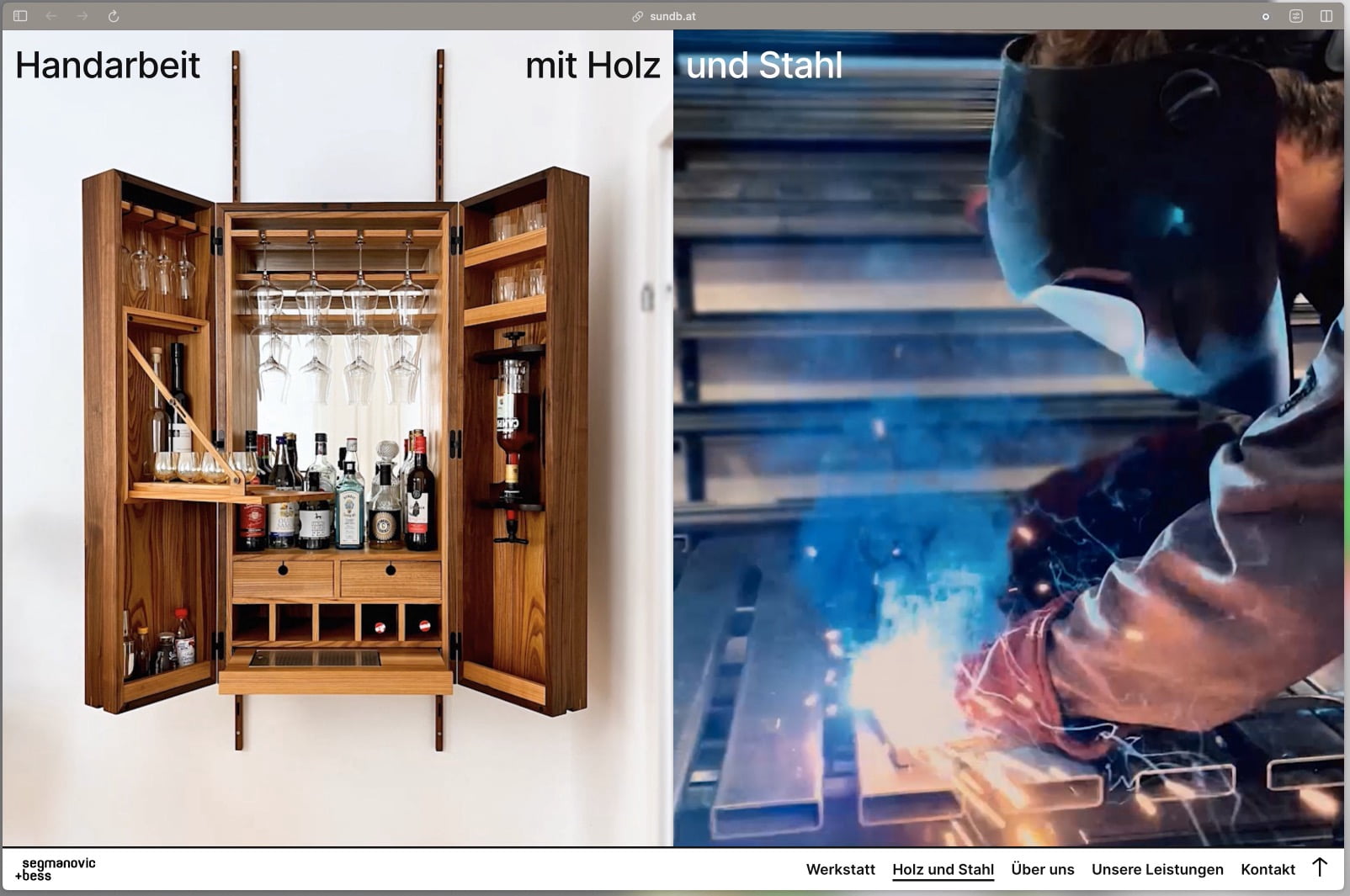
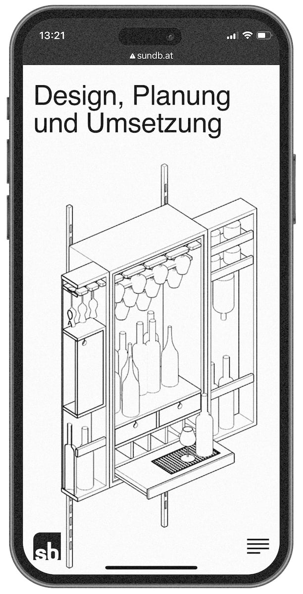
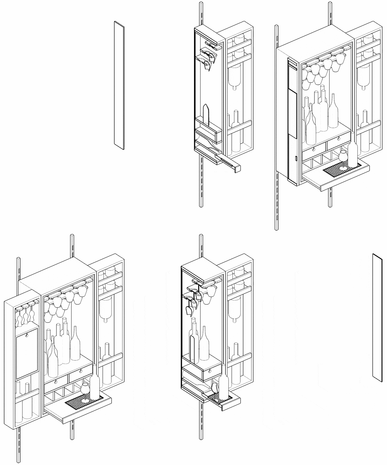
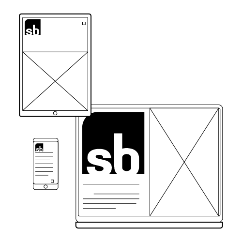
I took on the graphic design and development of a new ‘visual identity’ for friends who are master craftsmen in wood and steel construction in the course of merging their trades into a joint company. The project included a revision of the existing logo design, photographs and film footage of the workshop and the team and the conception of the website and the general visual language. The company is characterized by its very own modern style in furniture design and also works in the field of custom-made products, exhibition construction and garden design. The visual appearance should reflect the clear and refined language of the workpieces and their claim to sustainable and timeless design. The website deliberately sets itself apart from the ‘classic’ craftsman’s web aesthetic and is intended to make potential visitors want to see their individual piece of craftsmanship immediately and give them a feeling for the beauty of the versatile materials wood and steel and the intuitive and professional way in which the workshop works.


